You’re at a cocktail party.
You find yourself in a conversation with a few Web designers. (You’ll know they’re designers because they’re either the most brightly or most monochromatically dressed people at the party.)
You, however, aren’t a designer. You’re a marketer. You’re a landscape architect. You’re an engineer. You’re a baker.
Sure, like everyone, you enjoy looking at beautiful things. Your house is tastefully––maybe even eclectically––decorated. You own coffee table books full of classic artwork.
And you know a visually appealing website when you see one. But you don’t know how to actually make it visually appealing. So how can you, with just a few words, prove to these partygoers you know what’s up? How can you display your design bona fides?
Sprinkle these terms into your vocabulary and you’ll be––if not carried out of the party on the shoulders of the designers as a hero––a savvy conversationalist.
1. “Lately, I’m positively obsessed with anti-scroll blockers.”
It goes like this:
Someone visits your homepage. Your homepage is chock full of helpful content. And it’s long. Your homepage is long.
But because your website contains scroll blockers––i.e., visual elements that suggest there isn’t anything below what the user sees when they first load your webpage––the user never sees all of your great content. They don’t scroll.
So you––pretending to be a Web designer––declare your love for anti-scroll blockers––i.e., visual cues that say, “Yes, dear user, there is more to see by scrolling down the page.”
Here’s an example of a webpage with a scroll blocker:
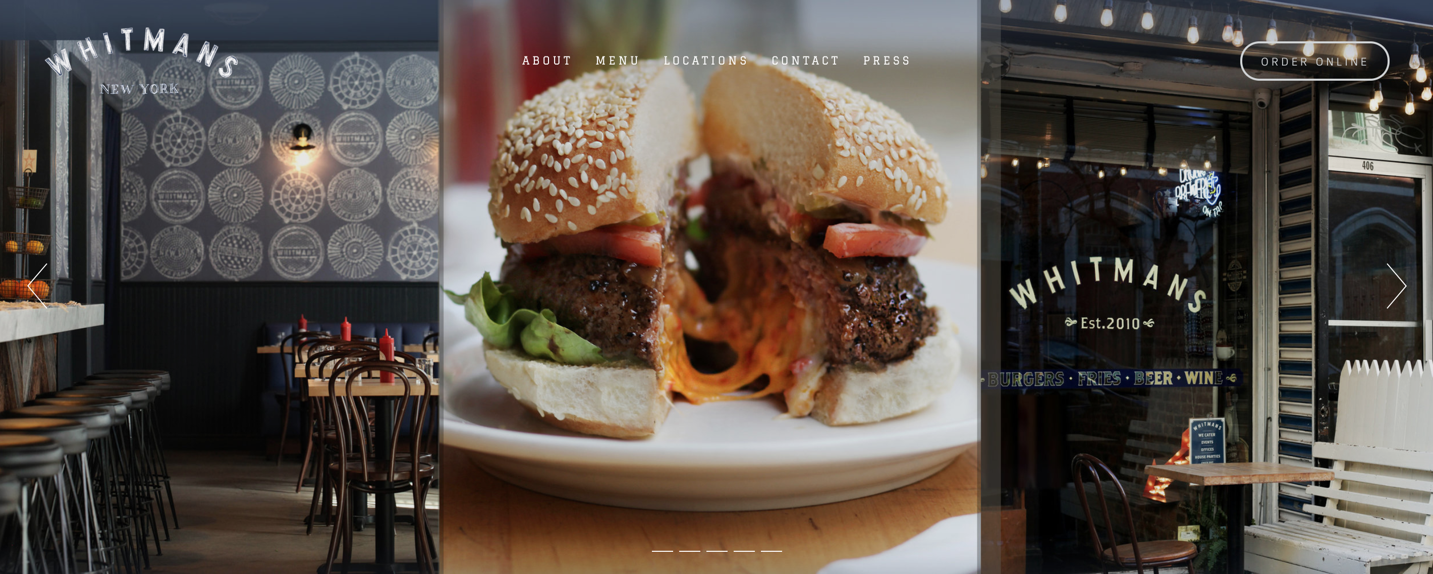
Homepage screenshot of Whitman’s restaurant in New York.
This is actually quite a long page, but the user wouldn’t necessarily know that because the page seems to end at the bottom of the browser. (The menu in the upper-right helps mitigate this a bit.)
We’re keen on moving users through a specific online experience. Anti-scroll blockers are one subtle way of crafting that journey.
Here’s the homepage of a website we recently designed, Crossroads:
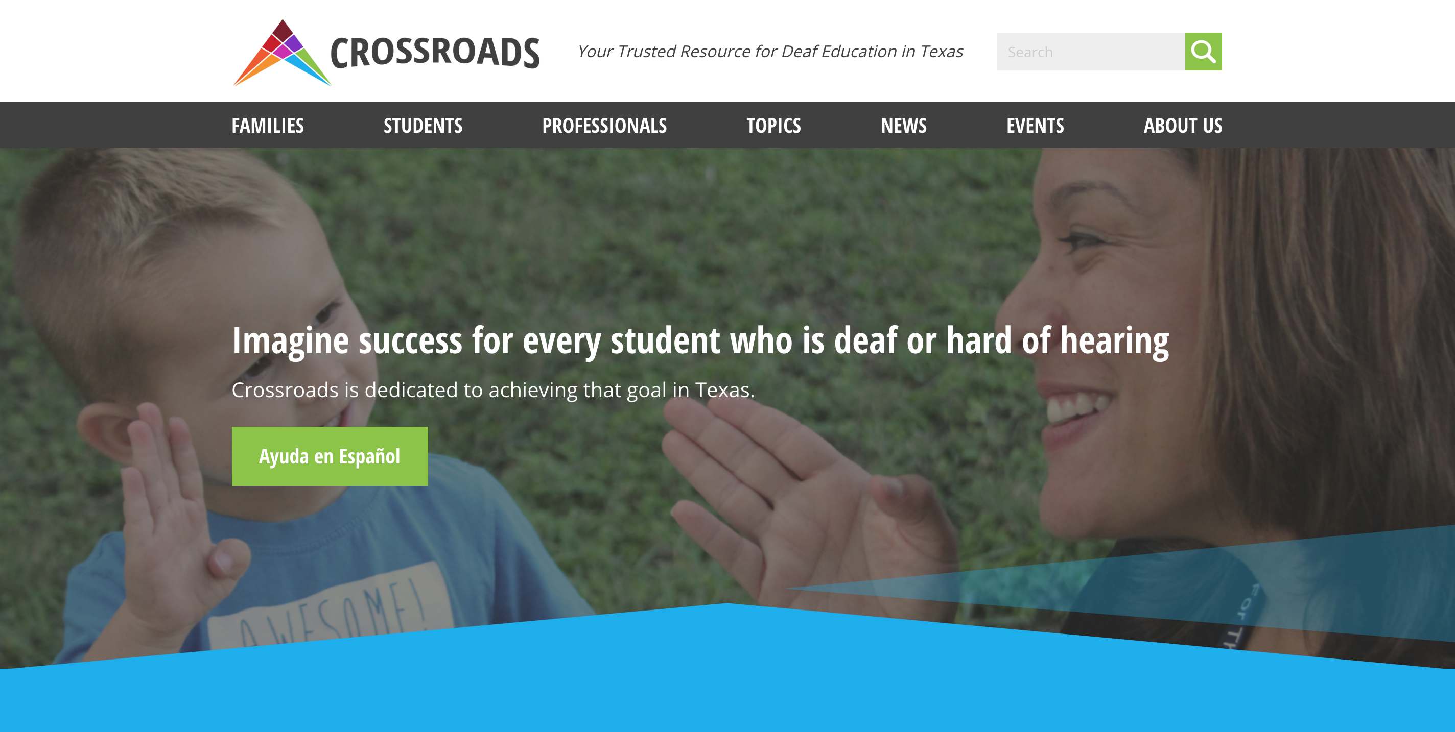
The “arrow/diamond” motif––i.e., the blue part––along with the hint of text peeking from the bottom make it clear that there’s plenty happening down below. As a bonus, the arrows also mimic the logo we designed for Crossroads.
(There are countless ways to address the scroll blocking conundrums. Read about some of them here.)
2. “I’ve been working hard on an elastic layout, and it’s giving me headaches!”
These days, a majority of web pages are laid out in one of two ways:
- Fixed Width – in which a webpage and its contents will always be the same size––for everyone, always and forever, no matter what.
- Fluid Layout – most of the page’s content chunks have ‘percentage widths,’ and thus, adjust to the user’s screen resolution.
But designers increasingly prefer a third type, elastic layout, which essentially combines the two to produce a fully flexible layout.
Elastic layouts depend on font size. The wonderful typographer and designer Jon Tan explains it succinctly:
An elastic interface scales with browser text size—commonly a default of 16px—which users can change if they wish. Some people make a permanent change for accessibility reasons, others use the UI controls to increase text size if they need to.
As the screen resolution increases/decreases, the square of the font size––also known as an “em”––adjusts, ensuring that usability is kept at a premium.
As Smashing Magazine points out, at first glance, an elastic layout is hard to distinguish from a flexible layout. And crafting an elastic layout can be time-consuming, as it requires many tweaks to optimize the user experience.
But if you nail it, an elastic layout will cast a wide net––improving your site’s usability for as many users as possible, regardless of their browser settings or screen resolution.
3. “I used to be a fan of flat design. But these days, I’m all about skeuomorph.”
The concept behind skeuomorph––pronounced “skew-a-morf”––is simple:
An object that retains ornamental design cues from structures that were necessary in the original. Examples include … a software calendar that imitates the appearance of binding on a paper desk calendar.
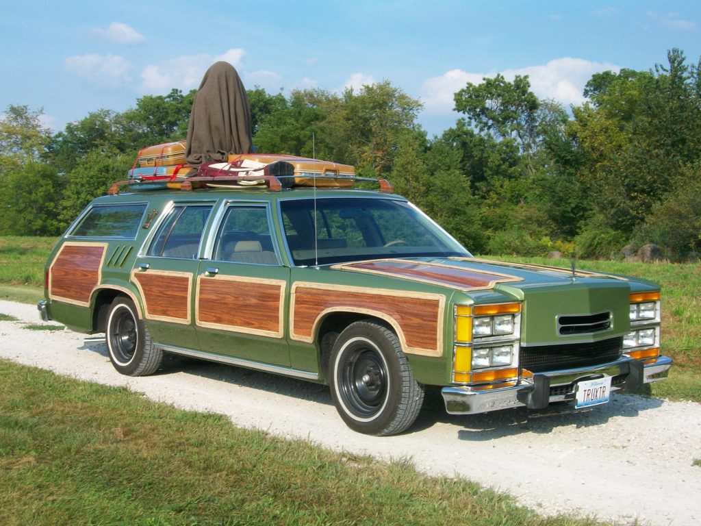
Skeuomorphs don’t apply only to Web objects. Wood paneling is a great example of a skeuomorph. It’s not functionally necessary, but it imbues the car with a certain feeling…
But for purposes of fooling your new designer friends, you’re referring mostly to digital stuff, such as…
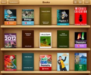
BOOKS!
CREDIT CARDS!

CALCULATOR APPS!
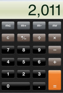
(Notice the subtle shading that suggests the buttons are actually raised.)
Advocates for skeuomorphs suggest that because the future is borne of the past, skeuomorphs serve as a bridge to the present, helping users adapt to new objects/applications quickly. Meanwhile, detractors claim that skeuomorphs are kitschy, tacky, and, most distressingly, resemble real-life objects without working like them––which is a user experience no-no.
We are agnostic on the issue of skeuomorphism. For example, our own website uses the opposite of skeuomorphism, aka flat design.
But when the situation calls for a touch of the past, skeuomorphism can offer striking aesthetics.
And besides, everything old will eventually be new again. Flat design is mostly in vogue right now, but as users grow tired of most websites looking essentially the same, we predict a resurgence in skeuomorphism in Web design. (Here are more great examples of skeuomorphism.)
The Takeaway
Every industry has its lingo. But Web design enjoys some of the best lingoes out there––lingo sure to make you seem savvy (or possibly obnoxious).
But forget trying to impress those Web designers at the party.
Instead, get to know some of these concepts––anti-scroll blockers, elastic layout, and skeuomorphs––in the interest of recognizing the small, yet powerful, design choices being made all over the Internet.
You’ll see beauty, elegance, and intention everywhere.