15winks User Interface Design
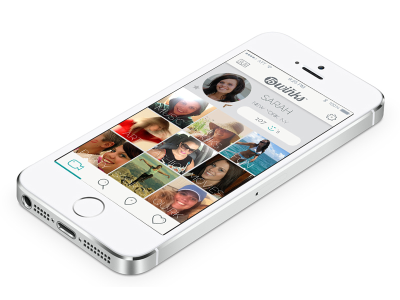 This is the settings screen for the 15winks app. It shows a primary generic video that everyone gets, as well as the paid portion which is slated for nine additional videos. These 15 second videos give a user things an online dating site could never show: Tone, inflection, personality, etc. These squares show up blank with a “+” icon in the center. Once they click the box they have the option to select a category and then the app guides them right into recording the video for that square.
The problems we tried to solve was to eliminate everything that people hated or feared with online dating using a mobile app platform. Some of the things people don’t like is the long on-boarding process of completing the 400+ questions with their profile, the “is the person married” question, and is the person who they say they are, or are they catfishing me? So, we set out to eliminate those issues. Using technology we thought we could, and we did. We used 15 second videos so you could find out about a person as opposed to looking at their likes and dislikes, bio, etc. This was a much more efficient way for people to gauge interest.
Since we force you to use the app to record and upload the videos you can’t cheat it. There’s no way to upload a picture or video from a few years ago. Also, we decided to date stamp the videos so people would come back and change these often to stay fresh and relevant. People change all the time and now you get fresh perspective on people in real time with real results. We also allowed check-in systems using GPS which enabled users to have a group setting instead of a face-to-face which most, in focus groups, said they liked. It was implied that it took the edge off and people could just relax and be themselves.
This UI design won a Platinum HERMES award while I served as the Creative Director on the project.

Platinum Winner 2014


