Icons are the hieroglyphics of the 21st century. By replacing words with symbols—and thus using much less real estate—icons aim to make consuming info quick and flexible. But there are some inherent pitfalls when using icons…
Potential Flaws in the Icon System
![]()
For most websites, the house icon indicates the homepage. But what about real estate websites, where it might suggest an actual house? Same icon, different response. The location of the icon might help identify its meaning—e.g., in a navigation menu bar, this icon is a pretty safe bet that it’ll send you to the homepage, while on a map, it would suggest a house/location. In other words, location location location!
This icon—the “hamburger”—means “menu” to most of the population, especially on a mobile website. But what if you’re on a website for a window fashion company? In that case, it carries a new context: mini-blinds. Similar shape, different meanings.
![]()
So when selecting icons to represent different sections of your website, consider the context of the site itself.
Establishing Icons
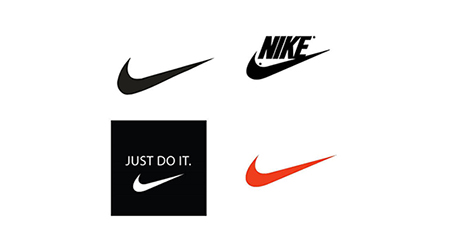
We (users) tend to learn responses to icons. It took about 10 years for Nike to remove its name from the swoosh icon. It took that long to establish that paradigm in the public’s mind—i.e., “swoosh equals Nike.”![]()

The same principle holds true for your music and video library: Play, Fast Forward, Pause, etc. We’ve learned to connect each word/function with a particular icon. Once this connection is widely adopted, the words are no longer needed. The icon suffices on its own.
But you have to put in plenty of time (and some good design) to establish an icon:

Stop Icon Abuse!
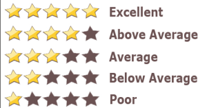
The “star” is a great example of how icons can be abused. The star system is widely used online to rate stuff—movies, books, products:

But it’s also used to highlight important documents and email messages in Google:

I tend to think Google should switch to using a bookmark icon, but until then, the star’s meaning remains a bit wishy-washy. You don’t really know what it means until you take in its environment. You can’t look at a star online and know what it will do every time, unlike the Play or House icons. Thus, words are still required for certain interactions—or the location of an icon must play a larger role in identifying its usage.
Iconography’s paradigms shift when the Web uses similar icons to mean different things. But advances in technology can shake things up, too. Consider the humble magnifying glass icon:
I’m trained to understand this icon to mean “search a webpage,” but it can also mean “zoom in on a document.” How do you make sure an icon indicates “zoom” instead of “search”?
But some adjustments are starting to clarify things…
Version 1

![]() This is the magnifying glass icon, but with the + icon inside. This further clarifies its usage—i.e., zoom in, make bigger, get up close. The point of using icons is to, eventually, do away with the needs for words. If you have to explain an icon, you’ve already failed.
This is the magnifying glass icon, but with the + icon inside. This further clarifies its usage—i.e., zoom in, make bigger, get up close. The point of using icons is to, eventually, do away with the needs for words. If you have to explain an icon, you’ve already failed.
As UX guru Jared Spool says:
A design is intuitive when people just know what to do and they don’t have to go through any training to get there. When a design is not intuitive, our attention moves away from what we’re trying to accomplish to how we can get the interface to accomplish what we want.
Version 2
![]()
![]() In this version, the magnifying glass was abandoned altogether, replaced by a simple square with an arrow pushing at the edges. This version emerged with mobile devices when pinching and zooming is often required. The arrows mimic the motion your fingers make on the screen.
In this version, the magnifying glass was abandoned altogether, replaced by a simple square with an arrow pushing at the edges. This version emerged with mobile devices when pinching and zooming is often required. The arrows mimic the motion your fingers make on the screen.
Time will tell which of these icons will win. But perfecting a single, simple usage is key to an icon’s long-term success.
The Final Word
Icons are tricky. Some are established, some are too new to stand on their own (without text), and still, others have multiple uses. Make it easy on your user to get the response/action they’re looking for. Doing so will either help strengthen an icon’s paradigm, reveal the need for a new icon, or force you to use words instead (or alongside). In the long run, thinking carefully about your icons will cause less friction and improve the ease-of-use of your website.